GGS 310 - Jennifer
Thursday, December 4, 2014
Thursday, November 13, 2014
Weekly Blog Post #10
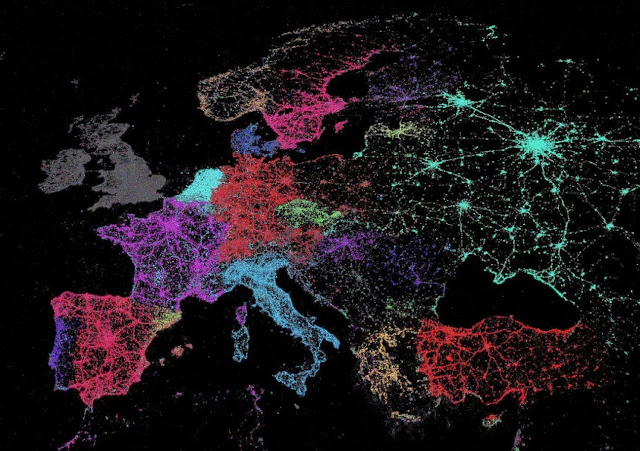
This is a map of the locations of tweets accross Europe/Asia with each color representing a different Language. The two variables are the locations of the tweets, and the color for each language. It's not the best map since it's missing key elements like a key and title, but I still really like the way it looks.
http://www.washingtonpost.com/blogs/worldviews/wp/2014/01/13/40-more-maps-that-explain-the-world/
Tuesday, November 4, 2014
Monday, November 3, 2014
Final Project Proposal
For my final project I would like to map the most visited cities in the world. I may narrow this down to most visited cities in Europe, however I do not want to cut out frequented cities in other parts of the world because many of the most visited cities are not in Europe. I chose to do this as my topic because next semester I will be studying abroad in Italy, so I want to make sure that I get to the majority of these cities. I also love traveling in general, and hope to visit many of these cities later in life too. This topic has been mapped before, however I hope to make a better, more useful and visually appealing version of it. I would like to do a dot density map rather than a proportional symbol map, because I do not like how many features are covered with proportional symbol maps. The audience for my map will be people who love traveling or who are going on a trip abroad. There are a few problems that I expect to face with this map. First, I have to decide what the scope of the map will be: just Europe or the entire world. My interest is in Europe, but it would be interesting to map all of the most visited cities for the entire world. Second, if I decide to do a dot density map and not a proportional symbol map I will have to decide if I should put dots just for the cities that rank in the top 100 most visited cities, or all countries. It seems a bit unattainable to do dots for all countries, especially if I have a scope of the entire world. However, if I did a dot density map I could do all the cities in the world and label the cities more clearly.
Here are examples of maps with similar topics to what I want to do:
Subscribe to:
Comments (Atom)


