Thursday, December 4, 2014
Thursday, November 13, 2014
Weekly Blog Post #10
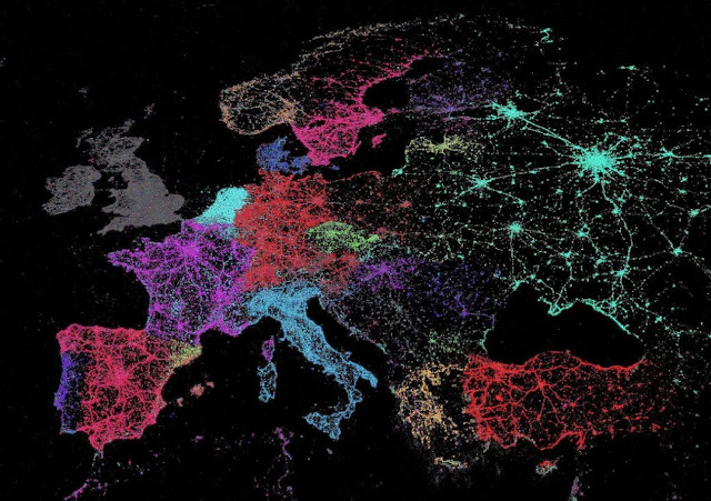
This is a map of the locations of tweets accross Europe/Asia with each color representing a different Language. The two variables are the locations of the tweets, and the color for each language. It's not the best map since it's missing key elements like a key and title, but I still really like the way it looks.
http://www.washingtonpost.com/blogs/worldviews/wp/2014/01/13/40-more-maps-that-explain-the-world/
Tuesday, November 4, 2014
Monday, November 3, 2014
Final Project Proposal
For my final project I would like to map the most visited cities in the world. I may narrow this down to most visited cities in Europe, however I do not want to cut out frequented cities in other parts of the world because many of the most visited cities are not in Europe. I chose to do this as my topic because next semester I will be studying abroad in Italy, so I want to make sure that I get to the majority of these cities. I also love traveling in general, and hope to visit many of these cities later in life too. This topic has been mapped before, however I hope to make a better, more useful and visually appealing version of it. I would like to do a dot density map rather than a proportional symbol map, because I do not like how many features are covered with proportional symbol maps. The audience for my map will be people who love traveling or who are going on a trip abroad. There are a few problems that I expect to face with this map. First, I have to decide what the scope of the map will be: just Europe or the entire world. My interest is in Europe, but it would be interesting to map all of the most visited cities for the entire world. Second, if I decide to do a dot density map and not a proportional symbol map I will have to decide if I should put dots just for the cities that rank in the top 100 most visited cities, or all countries. It seems a bit unattainable to do dots for all countries, especially if I have a scope of the entire world. However, if I did a dot density map I could do all the cities in the world and label the cities more clearly.
Here are examples of maps with similar topics to what I want to do:
Thursday, October 30, 2014
Wednesday, October 29, 2014
Thursday, October 23, 2014
Tuesday, October 21, 2014
Lab 6
The main difference between my printed map and my digital map is the vibrancy of the colors. The map is just as easy to read when it is digital as it is when it is printed, however the colors are slightly different. Although the printed colors are still blues/purples, it is almost as if it is a different color scale. The classes are still easy to differentiate despite whether the map is printed or digital. I probably would not change anything on my digital map after seeing it printed, because the printed map still displays the data well and although the colors are a little different, that is inevitable when printing maps.
Thursday, October 9, 2014
Weekly Blog Post #6
This map shows the overall water risk per country. I really like the range of color that was chosen for it and the effect that the color has on the reader. I also think the colors are logical--red for high risk and pale yellow for low risk.
http://matadornetwork.com/life/57-worlds-interesting-maps/
Tuesday, October 7, 2014
Thursday, October 2, 2014
Weekly Blog Post #5
This is a map of what percentage of total spending goes towards food for each given country. The map on the original website also provides more detailed information if you click on the number for each given country that has data provided.
http://civileats.com/2011/03/29/mapping-global-food-spending-infographic/
Tuesday, September 30, 2014
Thursday, September 25, 2014
Weekly Blog Post 4
I really like this map because it is 3-D. You can tell what the buildings actually look like, what land features/sidewalks/parking lots are around them, and all of the surrounding roads are labeled. It is also very aesthetically appealing and would make me want to visit the campus if I were comparing colleges.
http://www.uno.edu/about/campus-maps/lakefront-campus.aspx
http://www.uno.edu/about/campus-maps/lakefront-campus.aspx
Tuesday, September 23, 2014
Thursday, September 18, 2014
Weekly Bog Post 3:
This is a map of Greece that uses many different fonts to label different features such as oceans, cities, and islands. I picked it because since parts of it are not in English, the different fonts make it easier to be able to tell which features are cities vs. an island, etc.
http://www.maps-of-greece.com/
Tuesday, September 16, 2014
Wednesday, September 10, 2014
Weekly Bog Post 2:
http://www.agroatlas.ru/en/content/climatic_maps/Temperature_avg/Temperature_avg_01/
Thursday, August 28, 2014
Weekly Blog Post #1
http://www.businessinsider.com/22-gorgeous-maps-that-define-the-united-states-of-america-2013-7?op=1
This map shows the population distribution of the United States. I like this map because it displays a piece of information that is commonly placed onto maps in a way that is not so common. Most population distribution maps use gradient maps or dot-density maps to display the data, however the author of this map used elevation to display the population density instead. I think it is a very unique and interesting way to display this information.
Subscribe to:
Comments (Atom)


